Context — one hub, three audiences.
Apollo's component library had outgrown its documentation. Usage guidance lived in Figma captions, specs lived in engineers' heads, and best practices lived nowhere in particular — which meant every team was re-deriving the same answers on their own. The ask was one comprehensive hub that could serve three audiences at once: product designers looking for usage and IA guidance, engineers looking for accurate specs, and PMs trying to understand what was available and when to use it.
The bar was high. Apollo's components are used across every surface of the product — documentation that was wrong, outdated, or hard to read would cost more time than no documentation at all.
Approach — boilerplate first, workshop-shaped IA.
I treated each component page as a small product with its own readers. To get 50+ pages out the door without sacrificing quality, I paired two techniques: an AI-supplemented drafting pipeline for the mechanical parts, and iterative workshops with product designers to shape the IA every reader would land on.
The boilerplate pipeline drew on three sources, in priority order: Apollo's own functional guidance (how the component is meant to behave inside the system), current in-app usage patterns (how teams are actually reaching for it today), and industry best practices as the fallback when neither of the first two had a clear answer. Humans reviewed every page before it published — AI cleared the first draft; designers and engineers owned the judgment.
What I shipped.
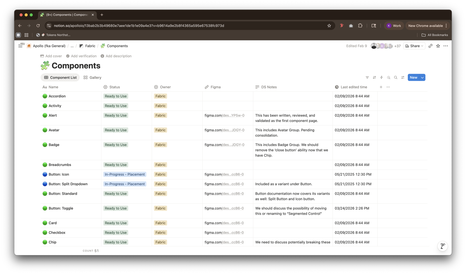
- 50+ component pages in Notion. Every page covers usage, anatomy, specs, accessibility, and do's / don'ts in a consistent IA — the same sections on every component, so readers learn the layout once and read everything faster after that.
- AI-supplemented boilerplate. An LLM pipeline that drafts each page by synthesizing Apollo's functional guidance, current in-app usage, and industry standards as a fallback — cutting first-draft time by an order of magnitude.
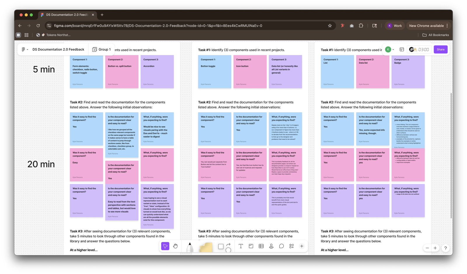
- Workshop-shaped IA. Rounds of workshops and lightweight feedback channels with product designers established what every component page needed to include, and in what order, before a single page shipped.
- Figma-linked components. Each documentation page is linked to — and linked from — its Figma component, so designers land on the docs without leaving their tool of choice.
Outcomes.
The hub has become Apollo's default component reference. Designers, engineers, and PMs all land in the same place and read from the same source of truth, and the Figma linkage has turned documentation into something designers open while they work, not as a separate trip.
Reflections — AI clears the floor, humans do the work.
The biggest unlock was the priority order inside the drafting pipeline. Apollo's own functional guidance first, current usage second, industry best practices as the fallback. That ordering is what keeps the output sounding like Apollo rather than a generic documentation template, and it's what made 50+ pages feasible without the docs turning into noise.
The other thing I'd repeat: shaping the IA with designers before writing any pages. Every workshop conversation compounded — by the time we started drafting at scale, the template had already absorbed the questions readers were going to ask.