Context — forms are where accessibility lives or dies.
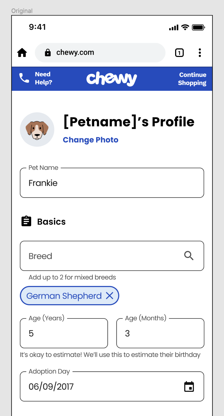
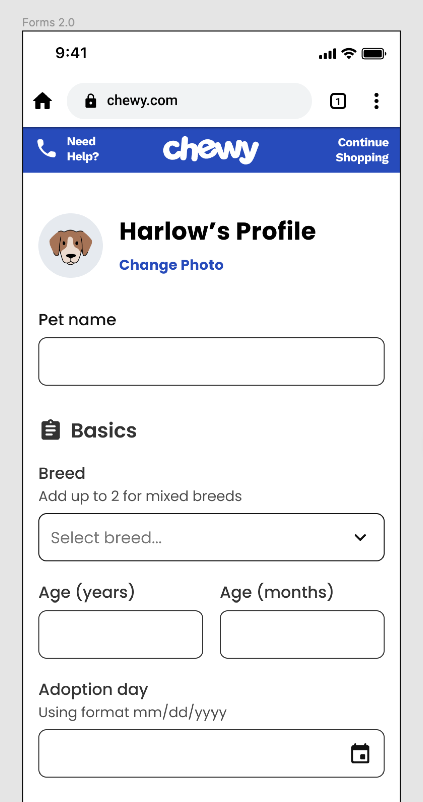
On a consumer surface that serves 20M+ monthly active users, forms are the hardest accessibility surface. Checkout. Account. Pet profile. Auto-ship. The moments where customers actually transact. Generic form components — off-the-shelf inputs, labels wired to placeholders, focus states you couldn't see — weren't meeting the needs of the customers Chewy cared about most: non-sighted users, motor-impaired keyboard users, and screen reader customers.
The Chirp team had built accessibility into its display components from the start. Forms were the next surface that needed the same treatment at the component level — not patched by each feature team, but built once, correctly, and consumed everywhere.
Goals — two, explicit.
Forms 2.0 was framed around two non-negotiable outcomes so every design decision had a target to hit:
- Enhanced accessibility. Every form field had to meet the latest WCAG guidelines, with particular focus on the customers generic inputs quietly leave behind — non-sighted, motor-impaired keyboard, and screen reader users.
- Configurability and customizability. The new library had to give product designers a richer set of options than Chewy's Material Design predecessors — enough room to tailor fields to a wider range of real use cases without forking the component.
Internal research — mapping the real use cases.
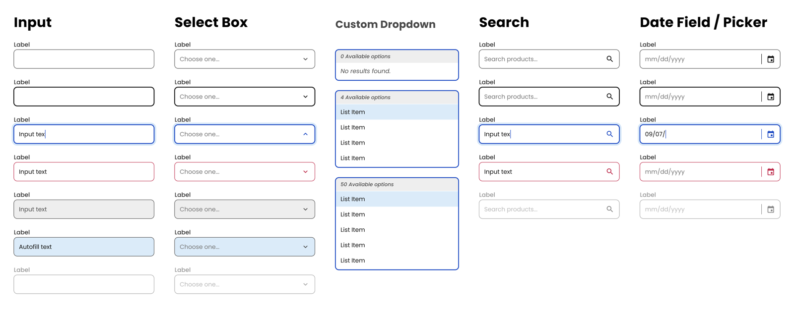
I opened the project by running internal research with Chewy's product designers — digital whiteboarding sessions that collected and organized the form-field use cases already live across the product. We aggregated dozens of patterns and grouped them by high-impact form element — the inputs that appeared in checkout, pet profiles, account, and auto-ship, where even small changes moved real revenue.
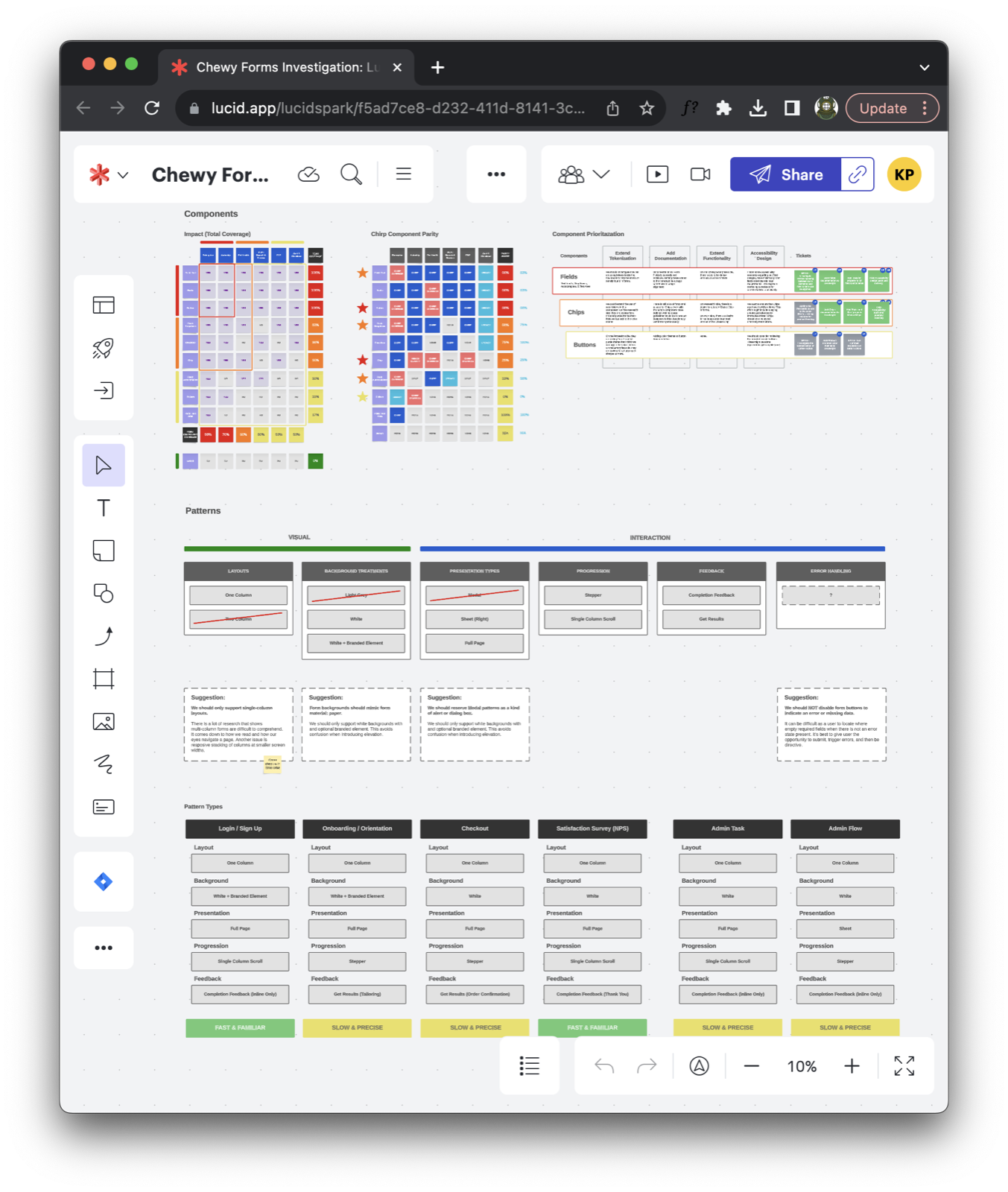
Grouping the work that way let the team prioritize strategically instead of rebuilding the library alphabetically. The whiteboards became the brief: a prioritized backlog of field archetypes, anchored to the surfaces our internal customers actually shipped on.
Approach — co-authored, not reviewed.
I partnered with Chewy's Director of Accessibility to raise the bar on inclusive form components — with particular focus on non-sighted users, motor-impaired keyboard users, and screen reader customers.
The move that changed the outcome was structural: accessibility stopped being a review gate and became a requirement of the build. Every form component was co-authored with accessibility criteria before the first pixel — contrast tokens, focus order, keyboard behavior, screen reader labels, and error semantics were inputs to the design, not findings after. When accessibility lives in the review stage, it becomes adversarial. When it's a co-authored requirement, it becomes a quality signal.
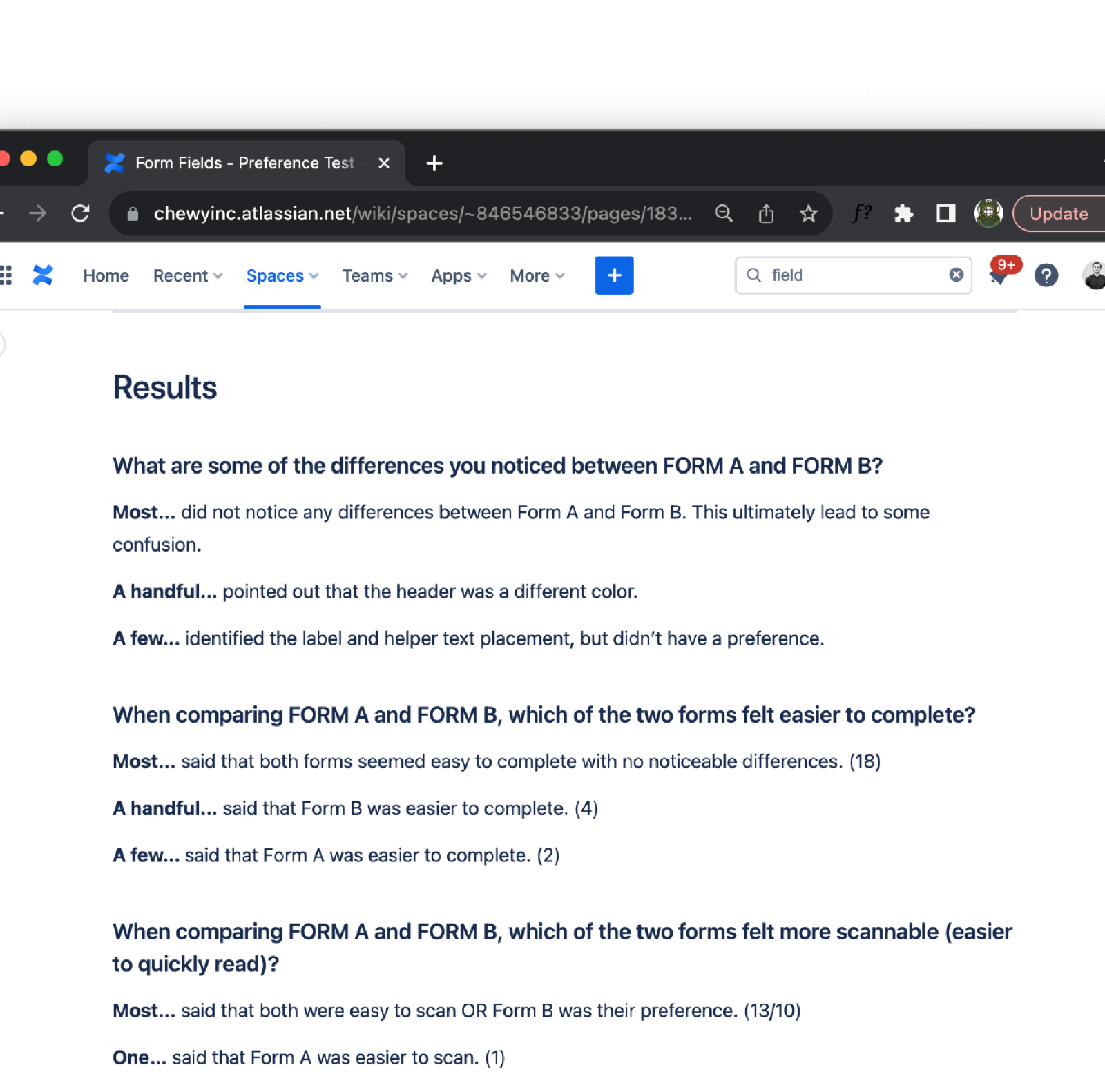
User testing — 24 participants, a real form.
I ran a preference test on UserTesting with 24 participants, recruiting for a spread of accessibility needs and digital comfort. The study used a realistic Chewy form — not an abstract one — so the findings would translate directly. Participants' interactions were recorded, giving me both quantitative preference signal and qualitative narration of where each variant broke down.
The analysis fed straight into the iteration: where participants hesitated, we tightened the label and help-text pairing; where screen reader output read awkwardly, we restructured the semantic markup; where touch targets slowed down motor-impaired users, we pushed the tap area up a notch. The final set of form primitives shipped with usability and accessibility both validated against real user feedback.
Experimentation — Pet Profiles, do-no-harm.
Before the new library rolled out at full scale, I partnered with Chewy's Analytics team to run an A/B experiment inside the Pet Profiles experience — one of the highest-traffic authenticated surfaces on the site. Success was defined deliberately narrowly: do-no-harm. The new form fields could not adversely affect user engagement or any of the KPIs the team already tracked on that surface.
Analytics owned the experiment design, the tracking, and the readout. The results confirmed what the research had predicted: the Forms 2.0 fields met the do-no-harm bar, validating the user-centric approach and clearing the runway for a broader rollout. Cross-functional partnership turned a design-system launch into a data-backed one.
What we shipped.
- A rebuilt form primitive set — input, label, help text, error state, focus ring, required indicator — with token-driven contrast and state styling across all four Chewy brand themes, and more configurability than the Material Design library it replaced.
- Keyboard and screen reader specs baked into documentation. Every form component page on Chirp's documentation site led with accessibility requirements, not appended them at the bottom.
- Shared contrast tokens and focus-ring primitives that other Chirp components adopted — accessibility improvements made once, consumed everywhere.
- An accessibility partnership model that other component workstreams reused: co-author with the Director of Accessibility at the brief stage, not after.
- A research-backed launch playbook — internal whiteboarding → UserTesting preference study → Analytics A/B against a do-no-harm bar — that Chirp reused for later high-risk component rollouts.
Outcomes.
Forms 2.0 gave Chewy a set of field components that shipped with accessibility as a default — not a remediation task — and proved in production against a do-no-harm bar. The partnership model with the Director of Accessibility outlasted the forms project and became the norm for subsequent Chirp workstreams.
Reflections — accessibility as craft, not compliance.
The move from review gate to co-authored requirement was the unlock. Once accessibility was an input to the brief — contrast tokens, focus order, keyboard model, screen reader semantics — the downstream QA debt dropped off. Teams stopped shipping forms that needed rework; they shipped forms that read correctly the first time.
The second unlock was pairing qualitative and quantitative evidence. The UserTesting preference study told us why a field worked; the Pet Profiles A/B told us it didn't cost us anything to ship. Neither signal was sufficient on its own — together they made the rollout uncontroversial.
And I'd repeat this one: center the hardest customer first. Designing a field that works for a screen reader user forces design clarity that benefits every user. Accessibility isn't a subset of UX; it's a test of it.