Context — an IPO-readiness window.
Apollo was repositioning for IPO readiness, and the product org needed a visual and technical reset that could carry it through the transition. Fabric, the internal design system, had the right bones — a catalog of components, shared Figma libraries — but the token layer underneath was improvised: color, typography, and spacing primitives that couldn't support theming, density, or future brand extensions without breaking existing product surfaces.
The pitch to leadership was Token Northstar: a modernization initiative to rebuild those primitives in public, with the rest of the product org along for the ride. Scope spanned 18 designers, 50+ engineers, and 6 feature teams — meaning the system of tools around the work mattered as much as the tokens themselves.
Approach — foundations first, tools second.
I grounded the initiative in research: accessibility audits of the live product, usability sessions with our highest-traffic surfaces, and a competitive analysis aimed at finding the unrealized gains in the landscape. The goal was to make sure the token refresh wasn't just a cosmetic move — it was tied to measurable quality improvements the business could understand.
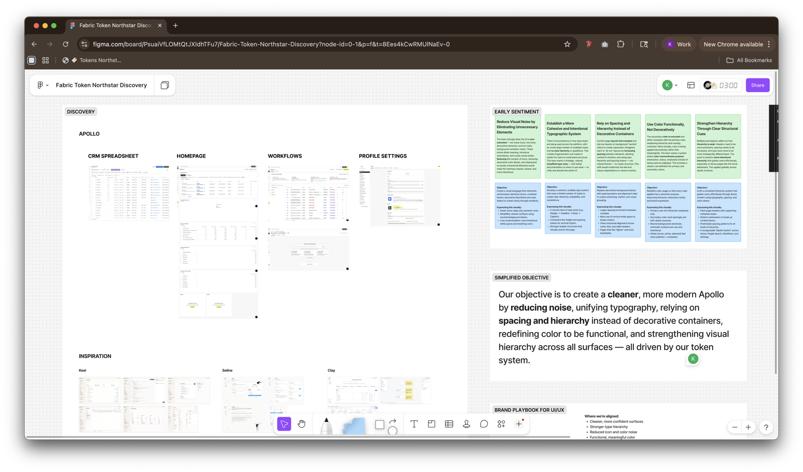
From that foundation I ran a concept round — three directions that each tested a different hypothesis about density, hierarchy, and accent. Stakeholder review on these set the direction that became Northstar.
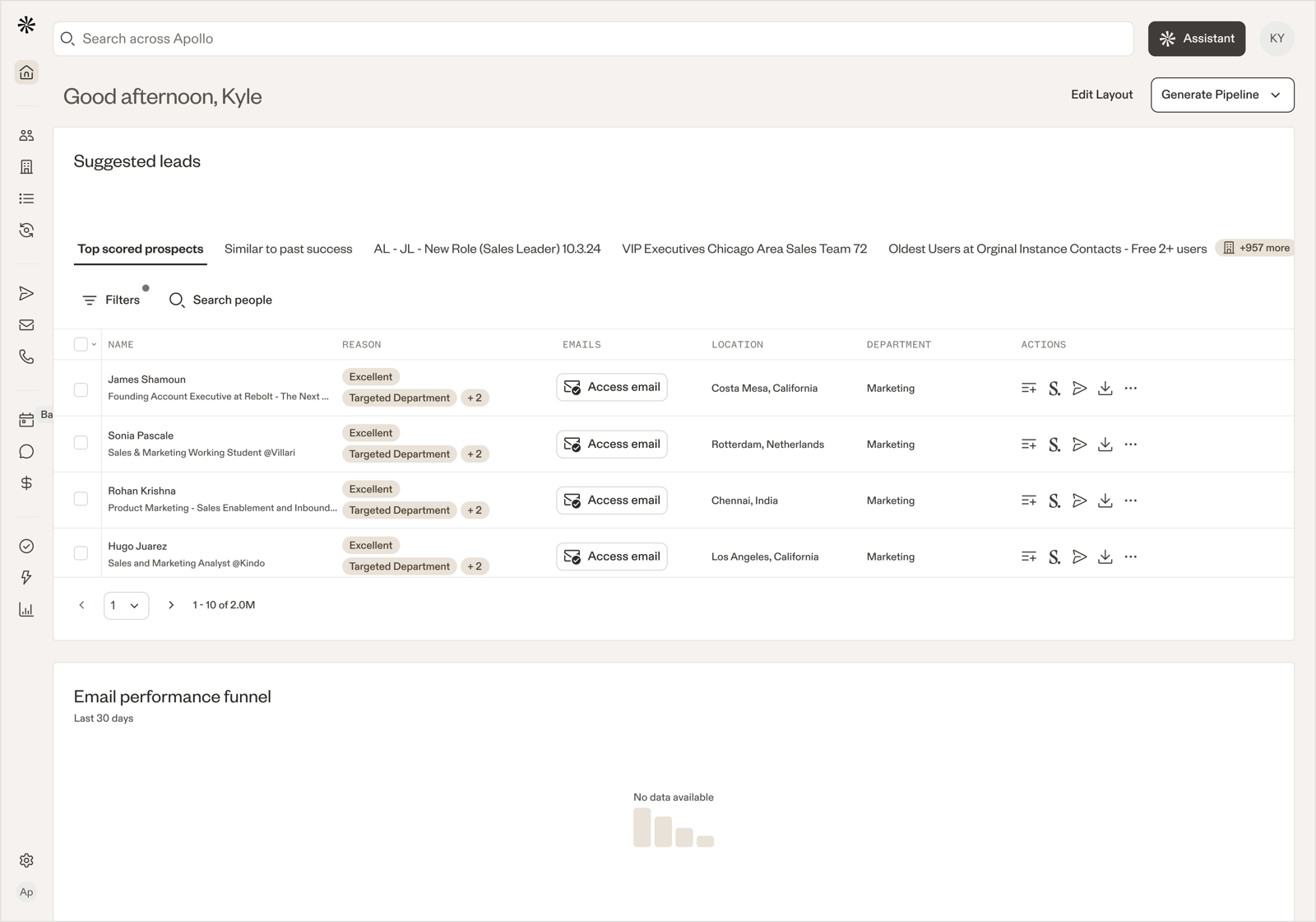
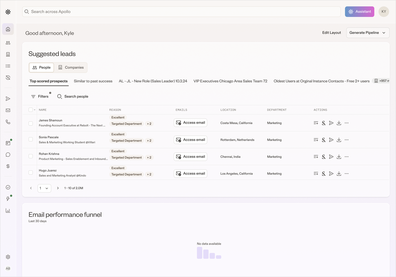
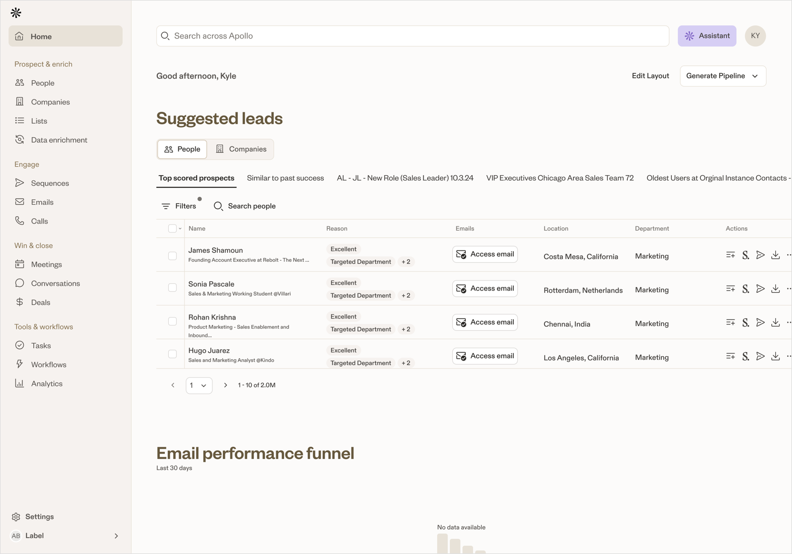
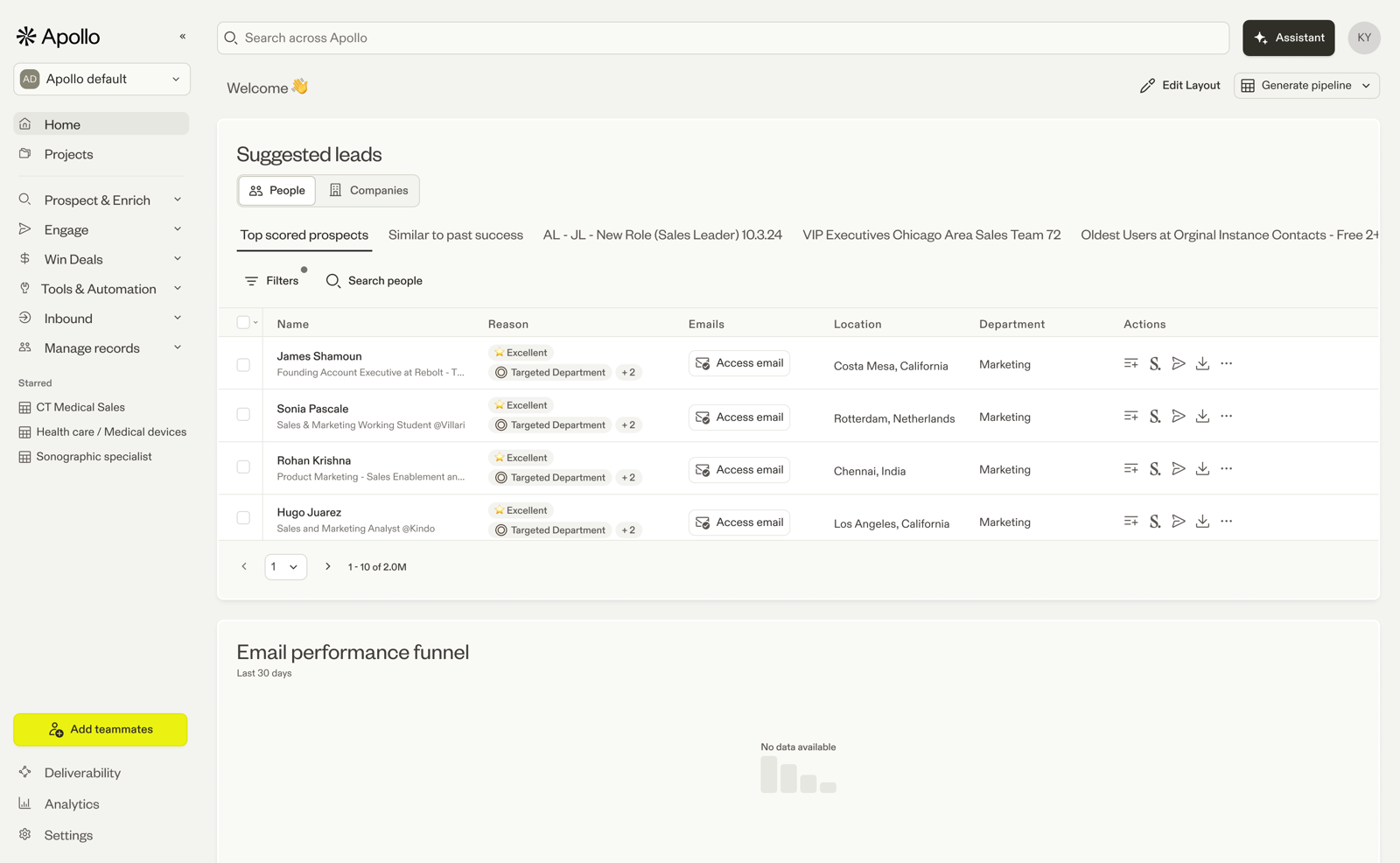
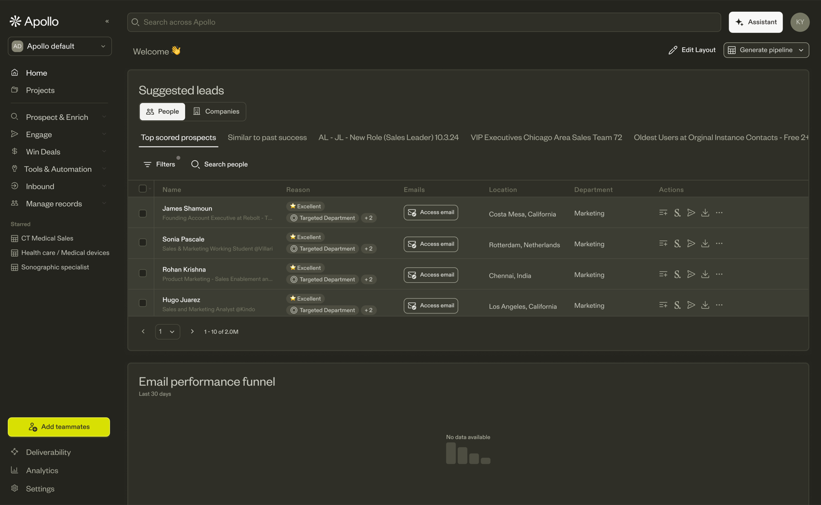
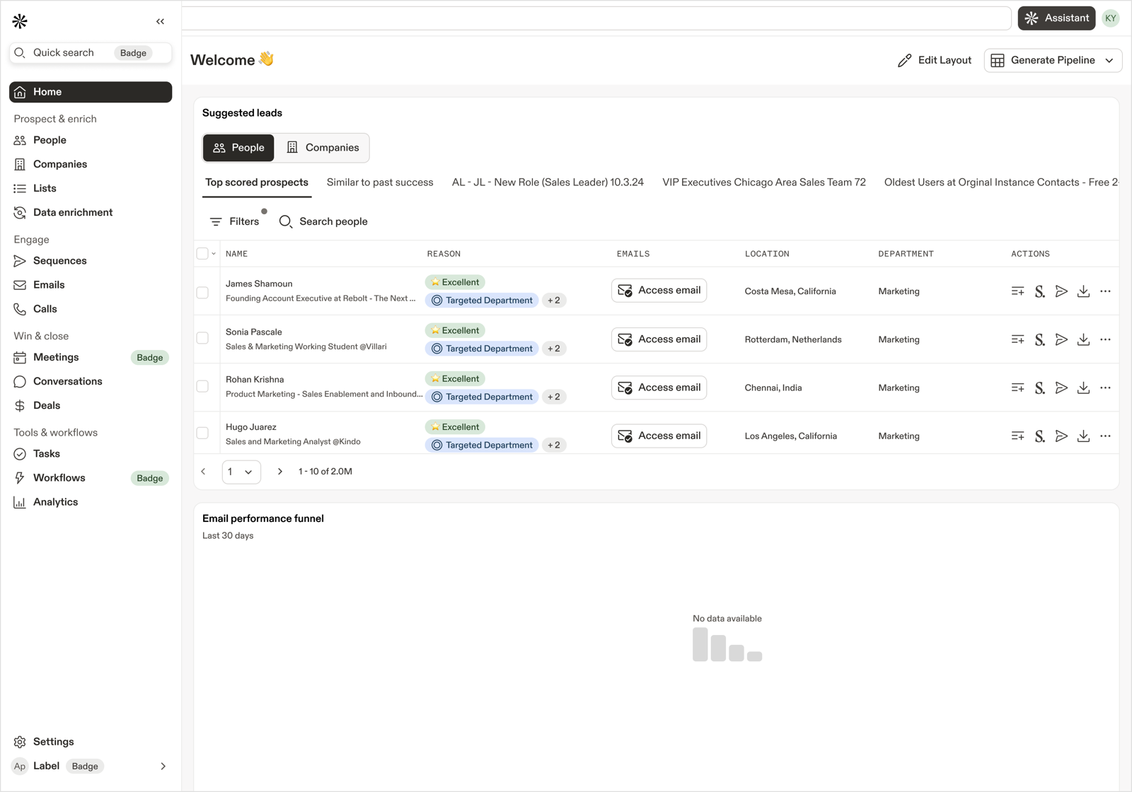
Alongside the tokens, I wanted a small fleet of internal tools so the migration wasn't something product teams had to opt into on faith. If designers and PMs could see the new tokens applied to their own surfaces before engineering touched a line, adoption would take care of itself.
Three phases.
Token Northstar rolled out in three phases, each rebuilding one layer of the foundation. Typography first — the most visible and least structurally risky. Spacing second — the connective tissue between every surface. Color last — the deepest rewrite, where the primitive scale itself changes shape.
Typography system.
Eighteen semantic typography tokens replace Apollo's HTML-style naming — h1, body-1, subtext — with usage-driven tokens organized into six functional groups: display, title, subtitle, body-lg, body-sm, caption. Two typefaces anchor the system: Founders Grotesk for display and headings, ABC Diatype for body, subtitle, and caption.
- Choose tokens by what the content is, not what size you want it to feel — a table column header is always subtitle-sm; a section heading is always display-sm.
- Five tokens carry Advisory WCAG status and require explicit contrast sign-off — handled at the component level, not per-instance.
Spacing system.
A four-step scale — 24 · 16 · 8 · 4 — with two distinct roles (gap and padding) applied across a three-level layout hierarchy: region → section → zone → component. The same value serves different roles depending on context; six principles govern every spacing decision so designers and engineers stop debating case-by-case.
- Gap and padding are different roles, not different values — 24px means one thing as card padding, another as section gap.
- Space communicates relationship. The smaller the gap, the stronger the implied connection between elements.
Color system.
Two rewrites in one. The primitive scales shift from linear to bell-curve ramps with expanded step counts — gentle contrast at the extremes where surfaces live, punchier contrast in the middle where interactive states live. The semantic layer gets a v2 structure — category / intent / emphasis / state — that collapses the token count by 50%+ while making every token self-documenting.
- Three committed surface tiers (human-00, human-05, human-10) own every background in the app — predictable light/dark pairings, no arbitrary surface grays.
- A single focus token (border/focus/base) governs every keyboard focus ring system-wide.
Supporting work.
Three threads ran alongside the phases — the tooling that made the migration legible, the AI pipelines that compressed the mechanical work, and the Brand partnership that brought product and marketing onto a single visual system.
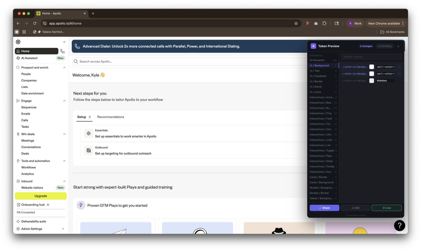
- Pre-Implementation Preview Tool. An internal Fabric tool that renders the live Apollo product with proposed token updates applied — stakeholder sign-off before engineering commits.
- AI-assisted migration. LLMs processed and documented token mappings across legacy libraries, compressing months of grunt analysis into weeks.
- One Apollo Brand. Partnered with Brand to take ownership of color and typography as shared primitives across product and marketing surfaces.
Outcomes.
Token Northstar has become the backbone of Apollo's visual refresh. The Foundations site is the default reference across design and engineering; the Preview Tool has collapsed the feedback loop between design proposals and stakeholder sign-off; and the One Apollo Brand partnership has given product and marketing a single shared language for color and typography.
Reflections — AI as a systems multiplier.
The biggest change in how I work this cycle was how deeply I leaned on LLMs. The token mapping work alone — auditing every legacy component and translating it into the new primitives — would have taken a team of two a quarter. Paired with careful prompting and human review, it took weeks. AI didn't replace the judgment calls; it cleared the runway so the team could spend more time making them.
The other thing I'd repeat: shipping the Preview Tool before the token refresh was final. It turned the conversation with stakeholders from "do you approve this change?" to "what does this change look like on your surface?" — a much better conversation.